Chapter 32 Plotting Data using Makie
Many of the examples above have involved plotting functions. This section gives some overview of how to think about data. In particular, recall that data is generally either discrete (that is there are either a finite or countable number of possibilities) like categories or numerical data that can be counted or continuous like data that is measured with real numbers (inches of rain, heights of people, etc.) It’s important to understand the difference to understand plots. This chapter covers plotting data using primarily
Makie
Recall that we covered plotting in Makie in Chapter 14. It’s important to have a grasp of the plotting basics including the backends. We will mainly be using
CairoMakie here, but that is not required. Recall to set the CairoMakie backend, we need to do:
using CairoMakie
CairoMakie.activate!()
Makie.inline!(true)
Section 32.1 Plotting Continuous
We first start with plotting continuous data.
Subsection 32.1.1 Histograms
If one has univariate data which is continuous, the standard way to understand the distribution of the data is to do a histogram.
1
Recall that this means that for every observation, there is only one value associated with it.
Subsection 32.1.2 Scatter Plots
We have already seen examples of plotting continuous data with the CO₂ data above. This data is the mean CO₂ level over each year and although the year seems like a discrete variable, time is actually continuous. Because of this, a scatter plot is a good way to present this data.
Section 32.2 Plotting Discrete Data in Makie
In contrast, let’s look at discrete data. I have done a lot of research recently using sports data and one project involved scoring in the National Basketball Association (NBA). Consider a season and looking at the number of points every team has scored. For the 2023-2024 season, if we consider the home and visiting teams, then here is the first few games:
Subsection 32.2.1 Barplots in Makie
We saw barplots in Chapter 19, but didn’t explain how to generate them. A barplot is a good plot to use if there is a sequence of discrete data. For example, the probability distribution function for rolling two dice seen in Chapter 18 resulted in the distribution:
| \(k\) | \(P(X=k)\) |
| 2 | 1/36 |
| 3 | 2/36 |
| 4 | 3/36 |
| 5 | 4/36 |
| 6 | 5/36 |
| 7 | 6/36 |
| 8 | 5/36 |
| 9 | 4/36 |
| 10 | 3/36 |
| 11 | 2/36 |
| 12 | 1/36 |
A bar plot of this data is plotted with the
barplot command. The call barplot(x,y) for vectors x and y plot a bar located at each value of x with height y. The heights from the table above can be generated with [(6-abs(i-7))//36 for i = 2:12] and then
barplot(2:12,h)
which produces the plot
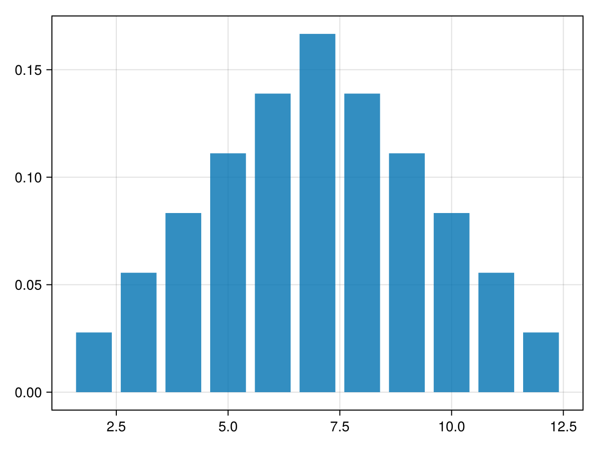
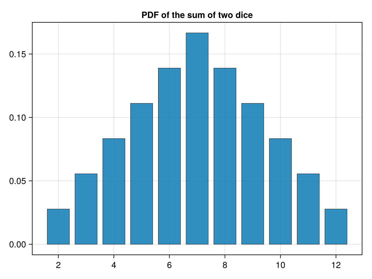
and note that the horizontal axis has underisable tick marks. We’ll fix this building a Axis object and changing the
xticks option. Additionally, I think it looks nice with small black borders around the bars and give it a title. If we run the following:
fig = Figure()
ax = Axis(fig[1,1],xticks=2:2:12, title="PDF of the sum of two dice")
barplot!(ax, 2:12,h, strokewidth = 0.5)
fig
which produces the following plot:
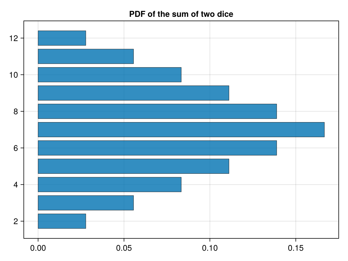
If one desires for the bars to run horizontal, then use the option
direction = :x on the barplot method. For example:
fig = Figure()
x = Axis(fig[1,1],yticks=2:2:12, title="PDF of the sum of two dice")
barplot!(ax, 2:12,h, strokewidth = 0.5, direction = :x)
fig
and note that we have switched the tick marks to
yticks. This produces the plot
Subsection 32.2.2 Grouped Barplots in Makie
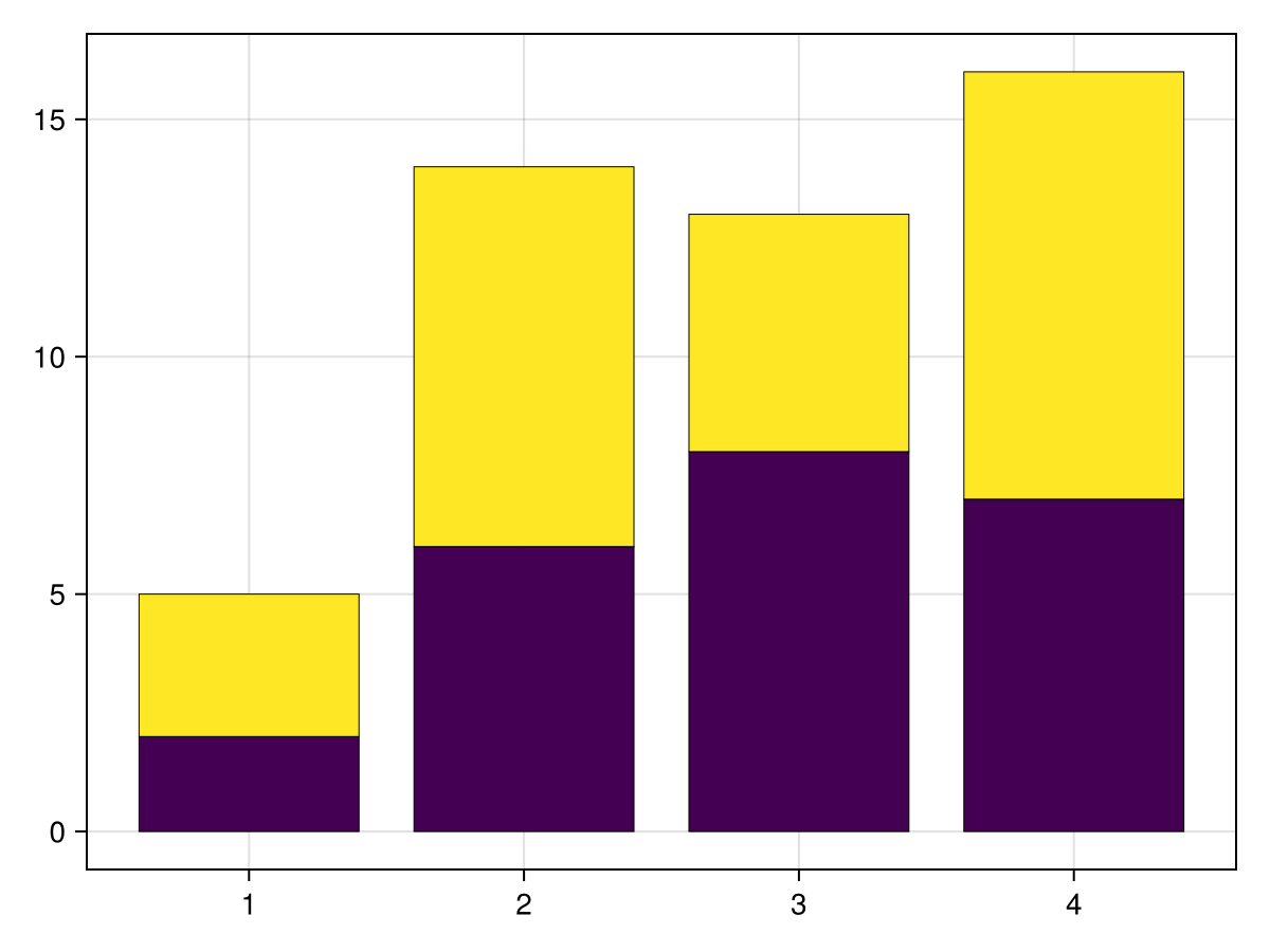
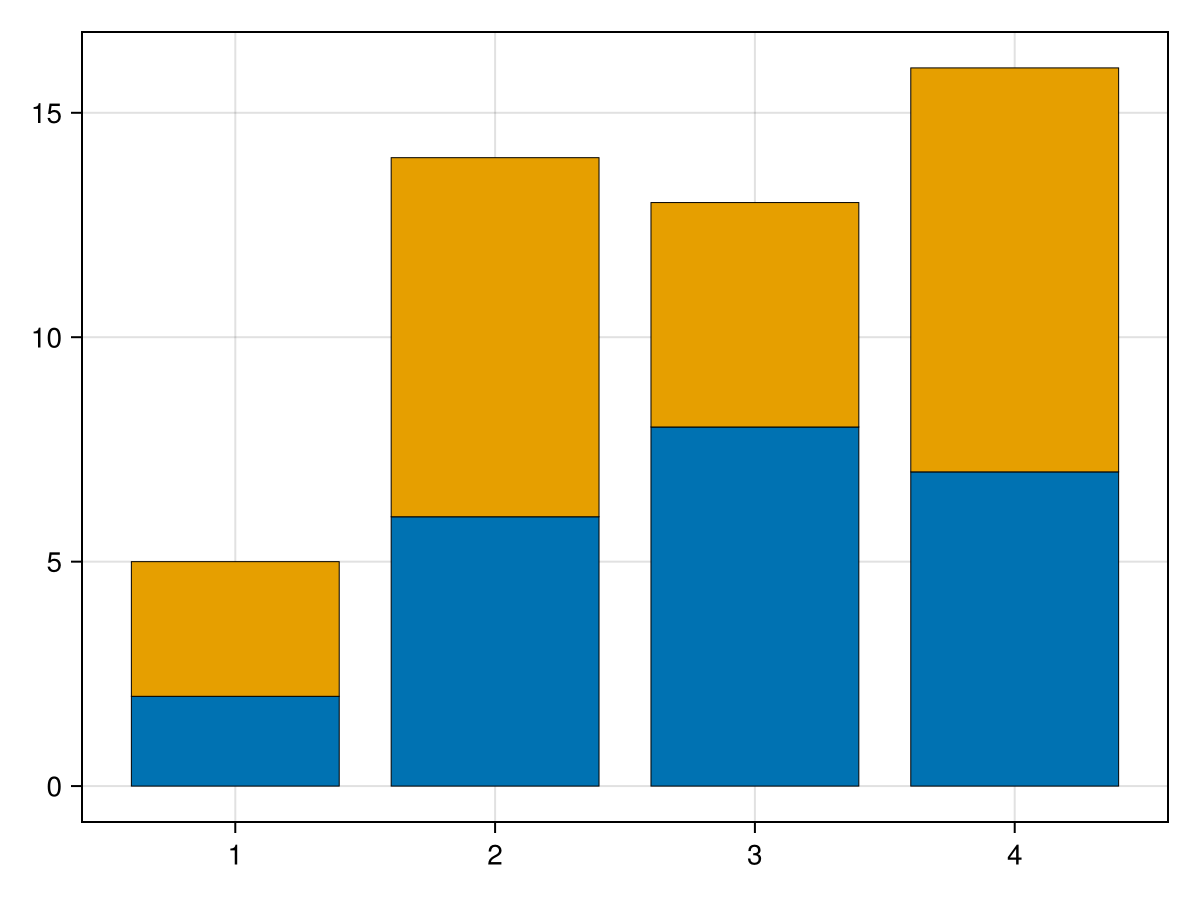
Another common way to display data is to compare a set to another one. If the data would often be displayed as a bar plot, then to compare it we can use a grouped bar plot. A grouped bar plot can either be stacked (which the bars are stacked above each other) or dodged (in which the bars are side by side). Let’s say we have the data
h1 = [2, 6, 8, 7]
h2 = [3, 8, 5, 9]
x = [1, 2, 3, 4]
fig = barplot(vcat(x,x),vcat(h1,h2),
 stack = vcat(x,x),
 color=repeat(1:2,inner=4),
 strokewidth = 0.5)
where we have used array concatenation explained in Section 6.11 and the
repeat method from Section 6.12. First, the stack of the barplot explains that the data is to be stacked and how to stack the results. Without the color option, the bars are stacked, but can’t be distinguished (try it!). Also, again, typing this on multiple lines is mainly for clarity--the same results occur if this was a single line. The results are:
I’m not a fan of the default colors that are used. One can choose any of the named colors. See Makie page on colors for more details. A common color grouping which works well for bar colors (that is there is contrast between colors) is the built-in
Makie.wong_colors(). The above plot can be changed with
colors =Makie.wong_colors()
fig = barplot(vcat(x,x),vcat(h1,h2),
 stack = vcat(x,x),
 color=repeat(1:2,inner=4),
 strokewidth = 0.5)
which results in
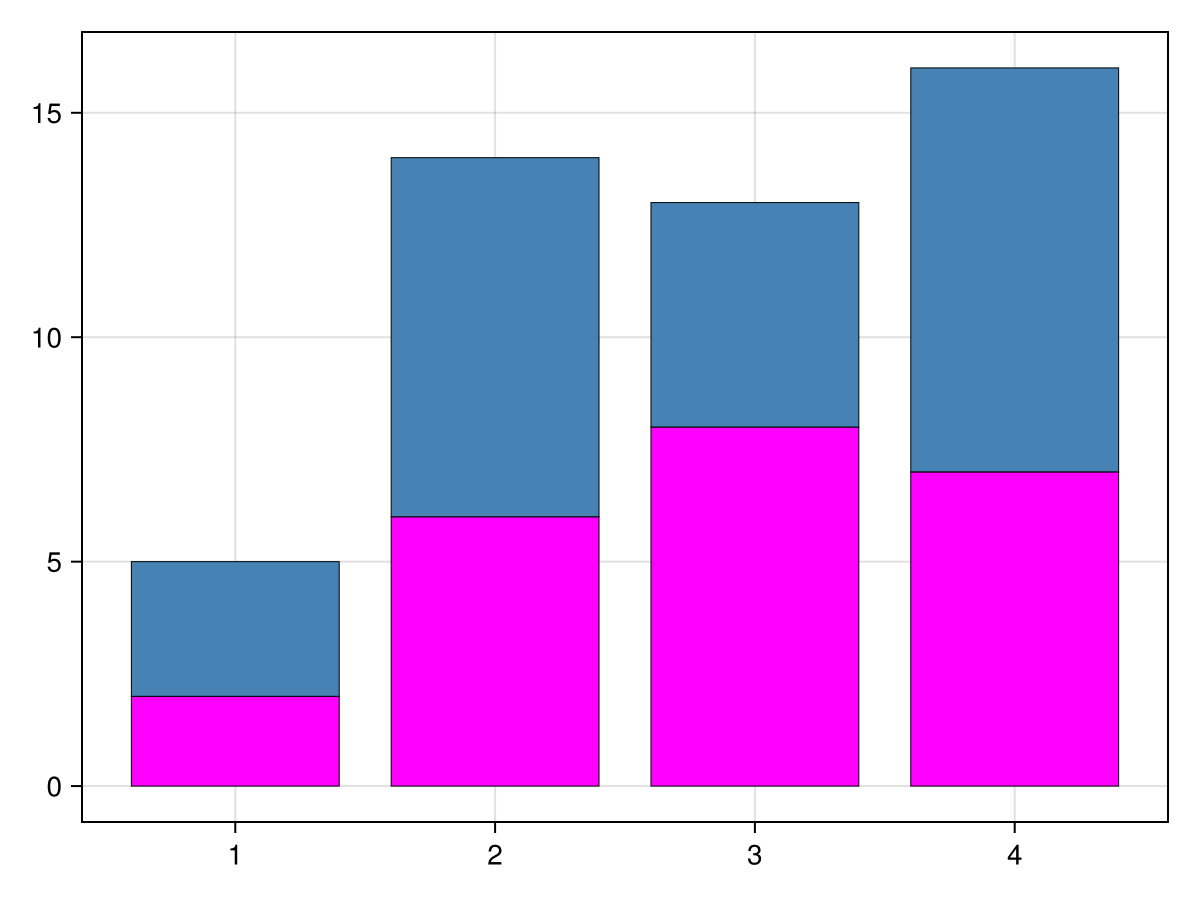
If you want to specify the colors, simply replace the first line above, with an array of named colors. For example,
colors = [:fuchsia, :steelblue]
fig = barplot(vcat(x,x),vcat(h1,h2),
 stack = vcat(x,x),
 color=repeat(1:2,inner=4),
 strokewidth = 0.5)
results in
However, if the desire of plotting two sets of data is to compare them, often plotting them side by side is better. This can be accomplished with the dodge option as in
colors = Makie.wong_colors()
fig = barplot(vcat(x,x),vcat(h1,h2),
  dodge = repeat(1:2,inner=4),
  color=colors[repeat(1:2,inner=4)],
  strokewidth = 0.5)
resulting in
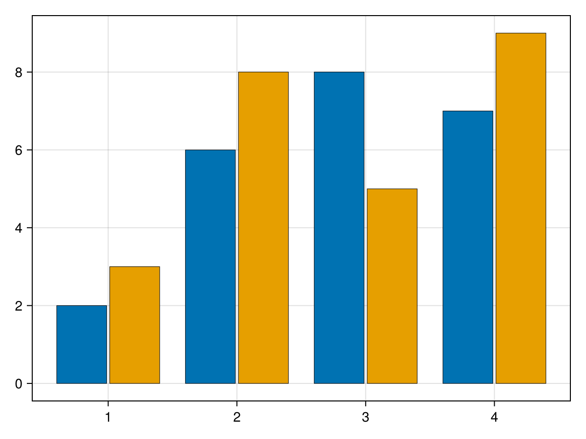
Note that the
dodge option determines the order of each group of bars for each x value. Although not shown, you can use more than two sets of bars for a group.
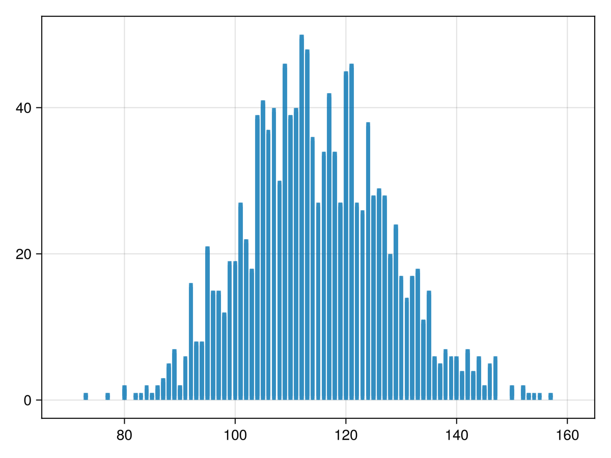
Subsection 32.2.3 Example of Realistic Barplot in Makie
To plot every score (which is discrete), let’s consider a bar plot in which the height of a bar at a given score is the number of games with that score. To generate this, we load in the
nba2024.csv file. Note you will need to download/install CSV and DataFrames.
using CSV, DataFrames
nba_scores = CSV.read("nba.csv", DataFrame)
and this lists about 15 rows of the file. The top of the file looks like:
1319×5 DataFrame     1294 rows omitted
  Row   DATE        HOME_TEAM              HOME_SCORE  VISITOR_NAME        VISITOR_SCORE
        Date        String31               Int64       String31            Int64
  1     2023-10-24  Denver Nuggets         119         Los Angeles Lakers  107
  2     2023-10-24  Golden State Warriors  104         Phoenix Suns        108
  3     2023-10-25  Orlando Magic          116         Houston Rockets     86
We won’t go into what a DataFrame is, but in short it is a common data structure for working with data that comes in columns with common types. These work well with spreadsheets. The details of a
DataFrame is presented starting in Chapter 31. To plot the number of home games with a given score (also called the score distribution), we use the counts function in the StatsBase package (so install it) and perform using StatsBase.
home_dist = counts(nba_scores.HOME_SCORE,70:160)
which returns a vector of the number of games with the score 70, 71, ..., 160. We can then plot the results with
barplot using
barplot(70:160,home_dist)
which results in the plot
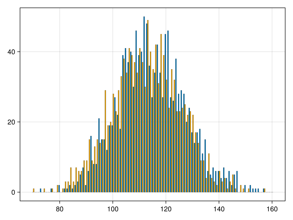
Another interesting plot is to place bars side by side for the home and visitor scores. This is a little but possible with the
barplot command. We just need to include all of the data together and then including a vector of grouping. The following is the code to do this:
colors = Makie.wong_colors()
barplot(
  repeat(70:160,2),
  vcat(home_dist,visitor_dist),
  dodge = repeat(1:2,inner=91),
  color = repeat(collect(colors[1:2]),inner=91),
  strokewidth=0.25
)
where this is one command but split onto lines for readability. The 2nd line is the horizontal axis which is just the same as the plot above except that we need to repeat it twice. The third line concatenates vertically (
vcat) the two distributions. The fourth line explain how to group the data (dodge is used to include it side by side or stack is to stack it vertically). The color attribute (line 5) sets the color for each bar--again, this is needed to be a repeated vector. The result of this is
More examples of plotting data can be found in Chapter 31 and other chapters in Part VII, which uses larger datasets and investigates how to gain insights into data from visualization.
