As discussed in Chapter 13, one of the main plotting environments for Julia is Makie, a relatively new plotting environment that had a goal to develop a completely Julia-based environment that was designed to "create publication-quality vector graphics, animated movies and interactive data exploration tools. Most options that are available today lack one or more of the following attributes:" (cite Makie paper).
Before plotting, make sure that you have the packages Makie and CairoMakie installed. The package CairoMakie is the backend package that does the plotting using the common interface (API) in the Makie package. Once the CairoMakie package is installed, to set this to the Makie backend enter:
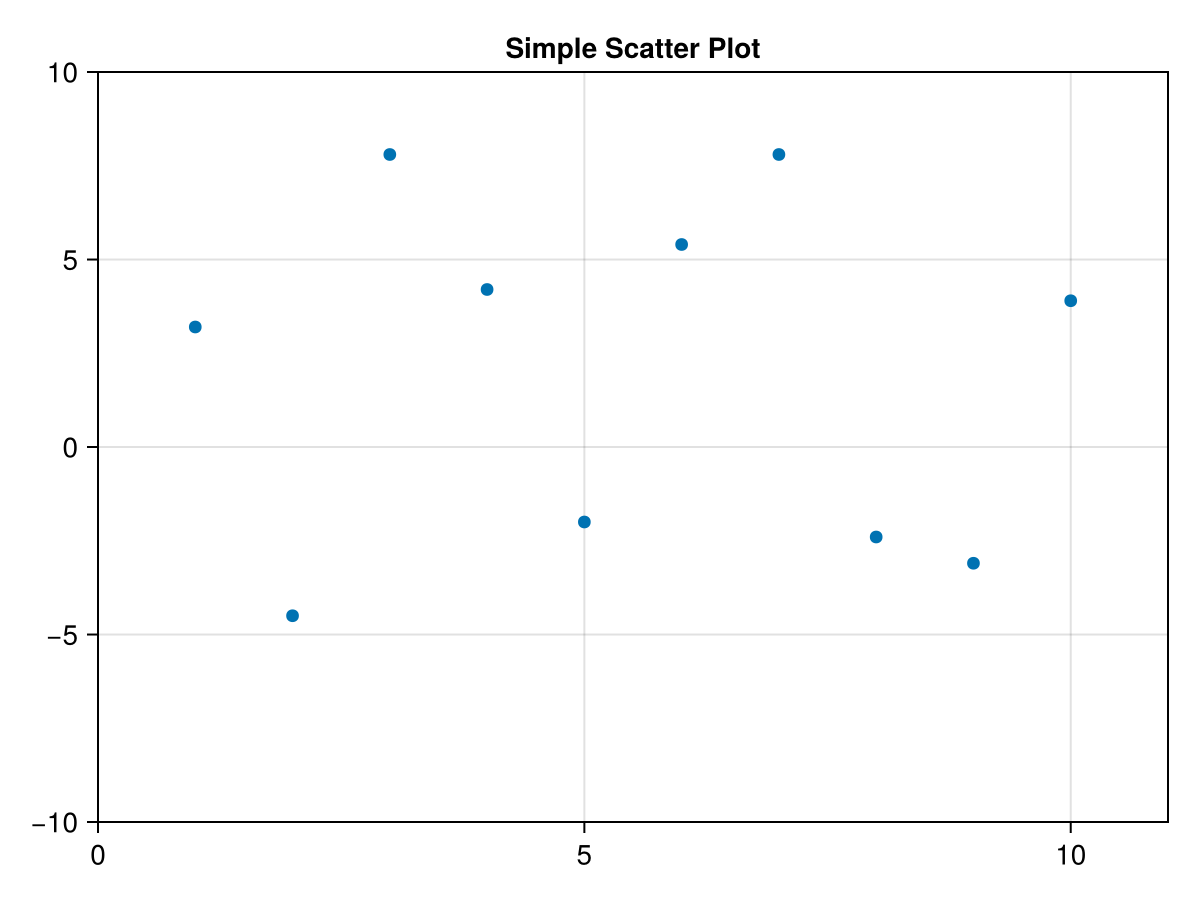
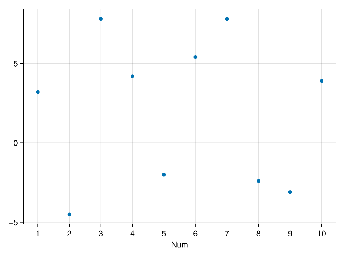
where the 3rd line above will allow the plots to appear inside a notebook interface instead of as a separate window. As an example, we’ll use the scatter command on a pair of vectors.
There are clearly a lot of options available for plots. It is important to understand the difference between altering the plot (say changing the style or color of the markers) and the axes (showing the grid or changing the limits). We will discuss all of these differences below, but an example to change the marker would be
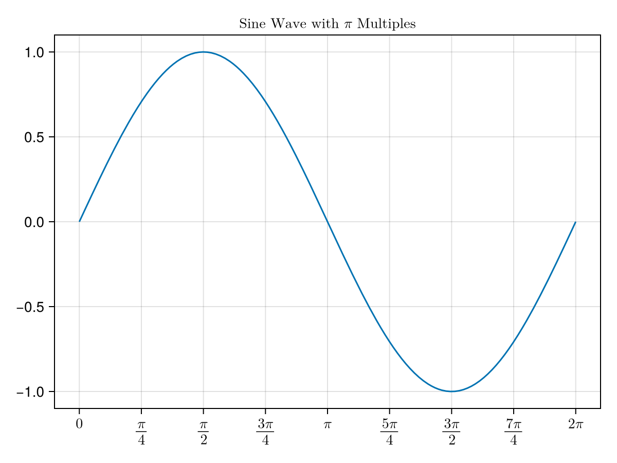
and if the presence of sin by itself in the function seems odd to you, one can use lines(0..2pi, x -> sin(x)) that is an anonymous function notation instead. The first argument is a plotting range explained below. The result is
You may have noticed that for the function plot above, the first argument is 0..2pi. We haven’t seen this structure before. Entering typeof(0..2pi) results in
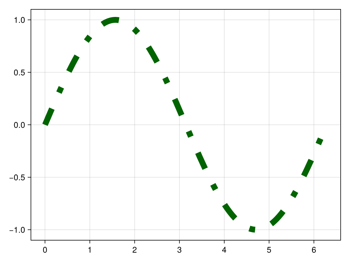
Similar to scatter plots, lines plots have options as well including linestyle, color and linewidth. The following is an example of changing all of these:
We saw above how to update the options of the plot object, that is the markers for a scatter plot or the line segments in a lines plot. There are also options to the Axis object, like changing the limits or tick marks or including title or axis labels. As in common in Makie, there are multiple ways of accomplishing this and we will cover two of these. First, we will look at passing Axis options via the axis keyword. Alternatively, we will get a Axis object from a plot and then update the options.
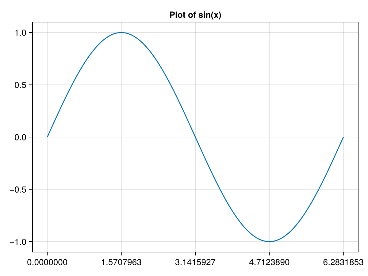
fig = lines(0..2pi, sin, axis = (title = "Plot of sin(x)",))
where we use the axis option, which is common to all 2D plots. The axis option needs to be a named tuple with names coming from options to the Axis object. Although it may seem like a mistake, there is a comma after the string that is the end of the title, however, without the command, to the right of axis = is not a named tuple and there will be an error. The result of the command above is
If there are a lot of changes that are to be made to the axis option, this may be confusing if they are all inside the given plotting command. An alternative is to get the Axis object that the plotting routine created and then update the axis. Here’s an example how to both update the xlabel (label on the x-axis) and the tick marks along the x-axis.
Some comments about the code above. Notice that we have assigned the scatter method to the tuple fig, axis. The first is the Figure object that the scatter plot produces and the second is the Axis object. This is helpful for updating either, however most aspects of a plot that needs to be updated falls onto the Axis object. The 2nd and 3rd lines above update the Axis, which is technically a mutable struct and we use the same dot notation that we have with structs and tuples.
There will be other examples of changing the Axis object later in this and subsequent chapters. It always a good idea to look at the Axis documentation for all details. The two methods in this section should work to update any of the axis options. As yet another alternative, below we will see how to create an Axis object with desired properties, however if there are just a few alterations to an Axis, one of the methods here is preferred.
We often want two plots (say two function plots or a function and scatter plot) on the same axes. In short, the way to do this is to get the variable representing the Axis. The technique in this section is to get the Axis associated with a plot and then add a line plot to the Axis. In the next section, we see a different technique, especially helpful for more complex layouts.
The left hand side of the assignment operator is fig, ax, which returns the created Figure and Axis objects when making a plot. Adding another plot to the one above is now relatively easy:
and note that the command is lines! because it modifies the ax variable. Also to get this to appear, the last line fig is used to get the plot to show. The result is
To include mutiple plots (different curves or scatter and a line plot) for example, use the ! version of the plot type. When using the ! version, the first argument should be the axis object that you want to place the plot in. You will see an error if the first argument is not an Axis object.
In the section above, we were able to get the figure and axis associated with a plot. This was helpful for either adding other plots to an axis or updating the axis. In this section, we will build a plot starting with Figure and Axis objects. This is mainly for more complex layouts, but is also an alternative to the methods from the previous sections.
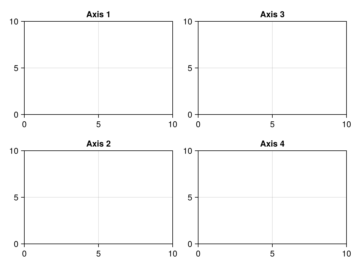
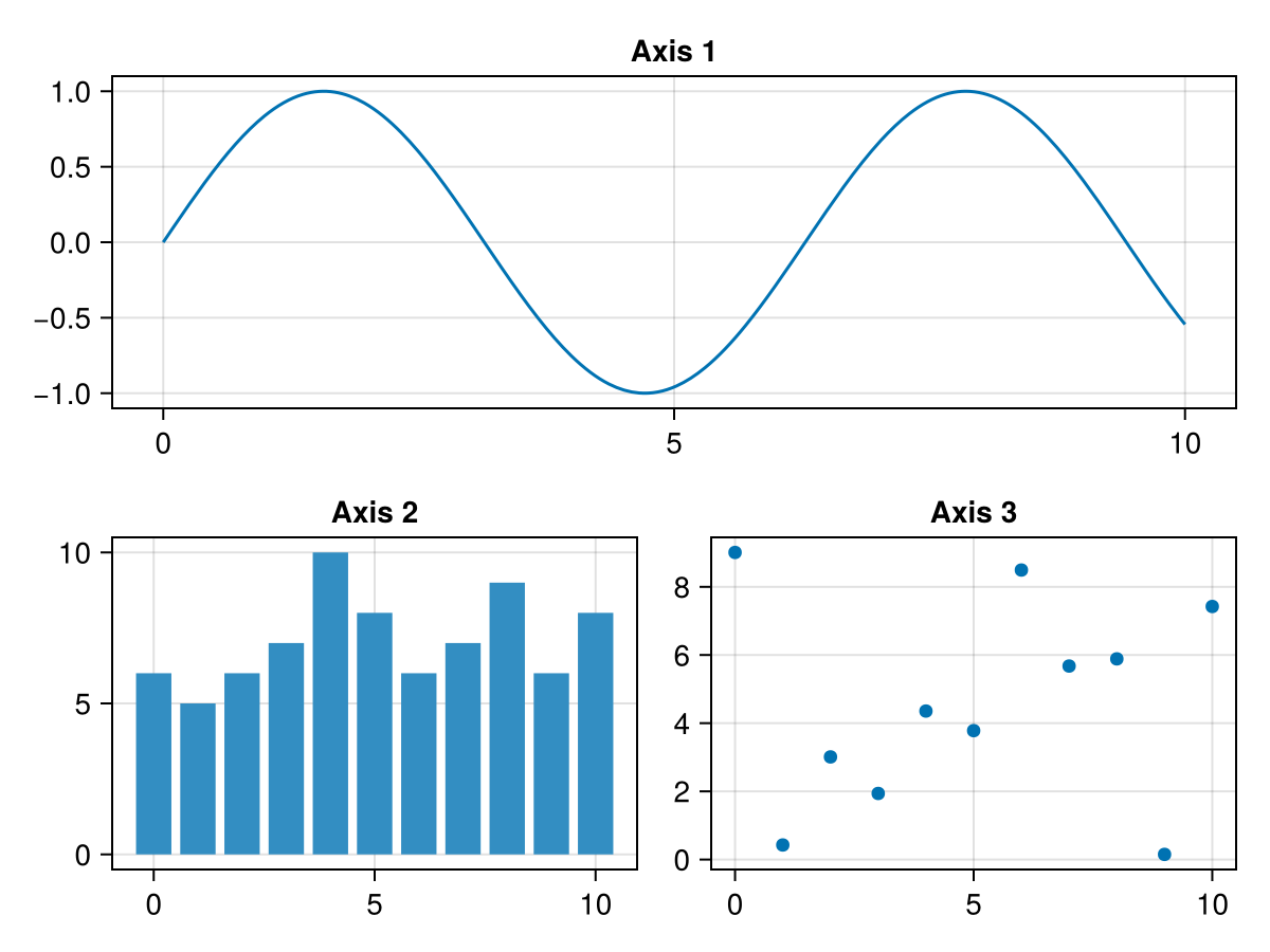
And upon running this, you will see an empty figure (white square) that we need to add things to. Although this is not so interesting, it is important. There are many things that happen when creating a figure, but most importantly, there is a grid layout that is created. To place items in the grid, typically plots need to occur on axes, so we will place axes in a layout with row/column indexing. For example
and you should notice many things. We can add a Axis to a plot (or four of them) without any plot within them. We will learn how to add a plot to an axis below. Above, the axes were placed by adding a row and column to the fig (Figure) above where the row and column is used in an array like notation. Notice that fig[1,2] places the axis in the first row, second column. Also, the default plotting window (limits) for an Axis is between 0 and 10.
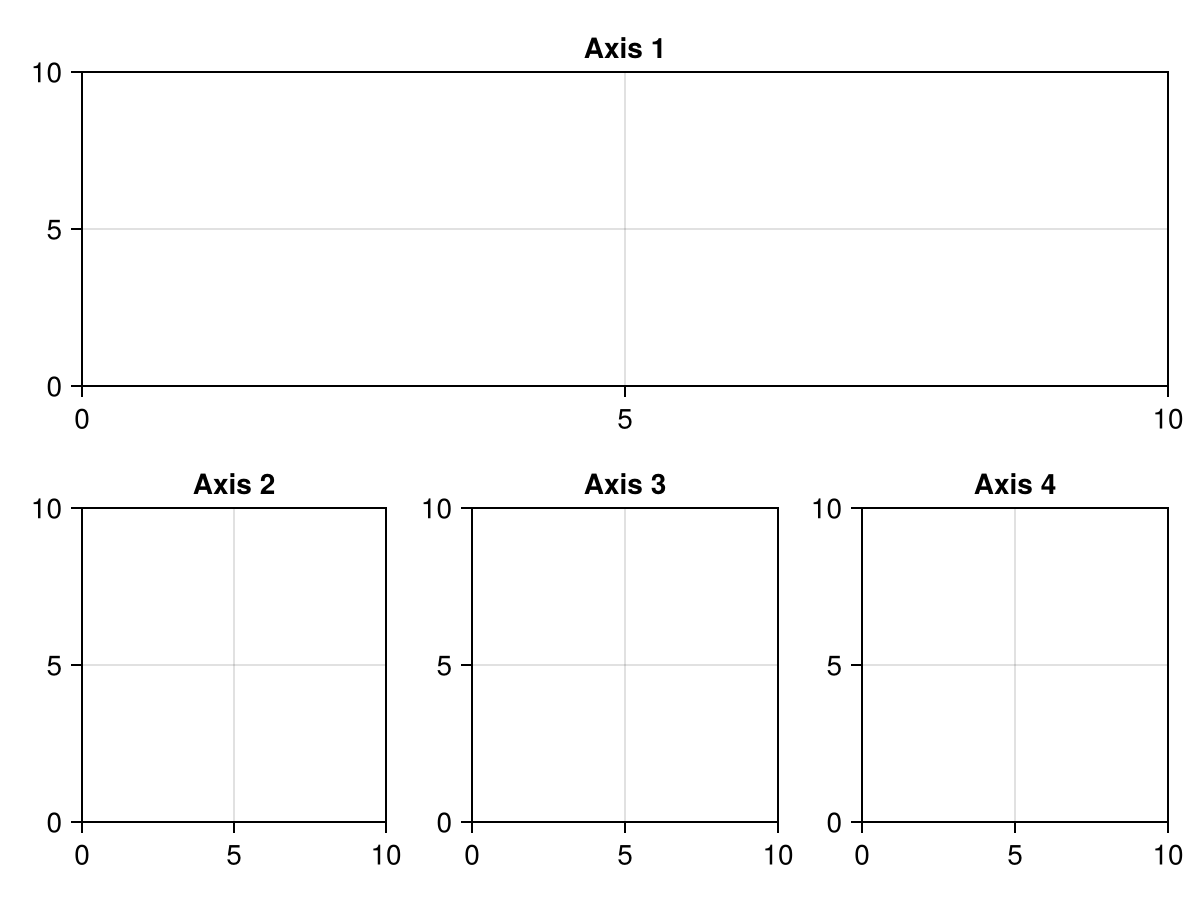
You may wish to stretch an Axis across multiple rows or columns. Here’s an example where the first row has one axis that stretches across 3 columns and the second row has 3 axes.
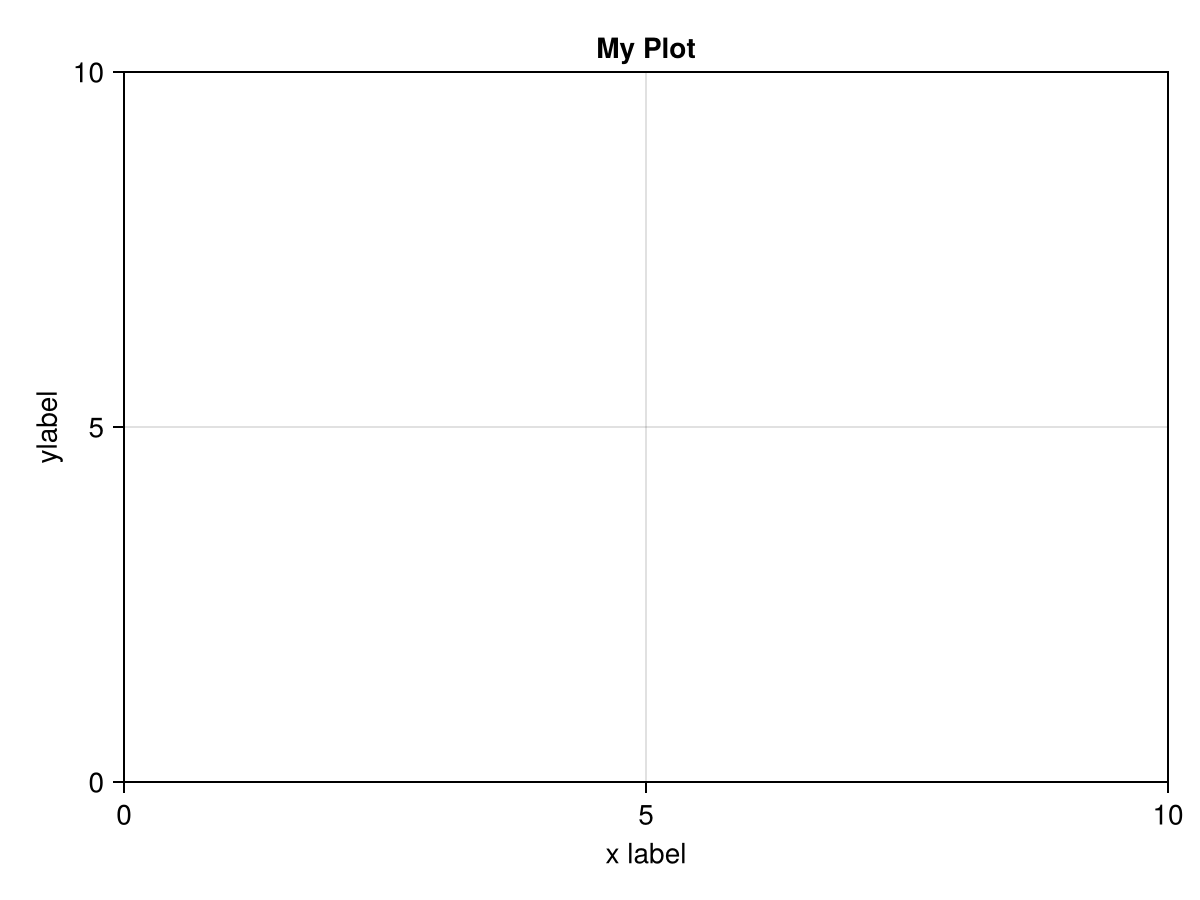
We saw above how to place an Axis object inside a Figure. Upon creating the Axis, we can give other options. We will cover some of the important ones here, and then refer to the documentation. The first option to an Axis is a title that we saw above. Just pass the title in as a string. Other basic options are the xlabel and ylabel. The following code
There are plenty of other options available for an Axis. See the documentation on Axis for more information. One big thing to note is the separation of axis options (anything that isn’t a plot) should be done to the Axis object, whereas as we will see below, changes to the plot will go on the individual plotting function. We will see other examples of this below.
Even though we can do some elaborate layout of axes, we haven’t done any plotting on them. In fact, there are two ways to plot via Makie. First, as we saw above, we can use plotting functions like lines or scatter to make plots. This is fine for relatively simple plots or just for a quick plot using defaults. If we desire additional features to a plot, generally we will create Figures and Axis objects and the add plots to them with commands like lines! or scatter! (note the !). Recall that convention in Julia is if an argument is being modified that the name should end in a !.
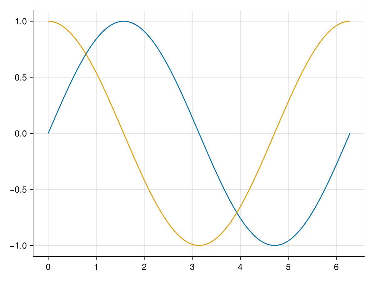
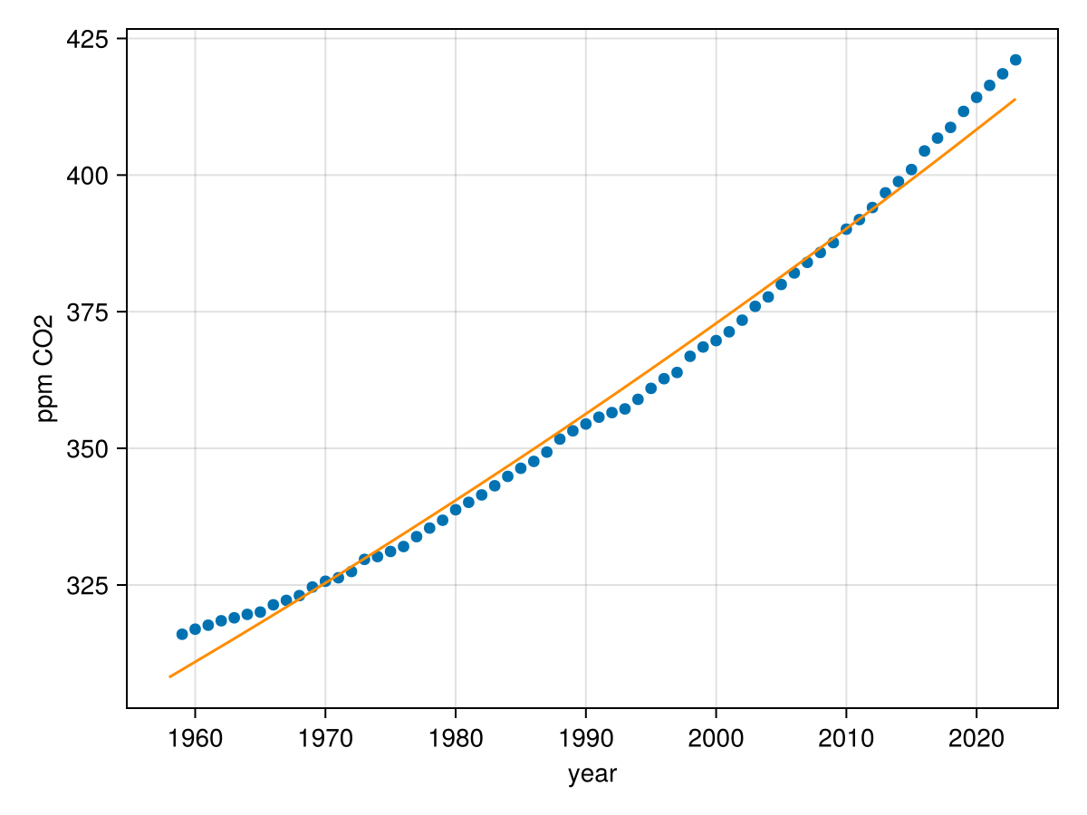
This is the way to include either multiple function plot or a scatter and function plot on the same axes. Consider the scatter plot from Chapter 13 which is the data from CO₂ levels. We can add an exponential function to them as well in the following way. 1
The data is available at this NOAA webpage and should be downloaded and saved in the same directory as your Julia notebook.
Above, we saw adding different axes to a Figure by placing Axis objects in a grid. We can add plots to these axes using the scatter! or lines! methods where the first argument is the axis number where we wish to place the plot. As an example:
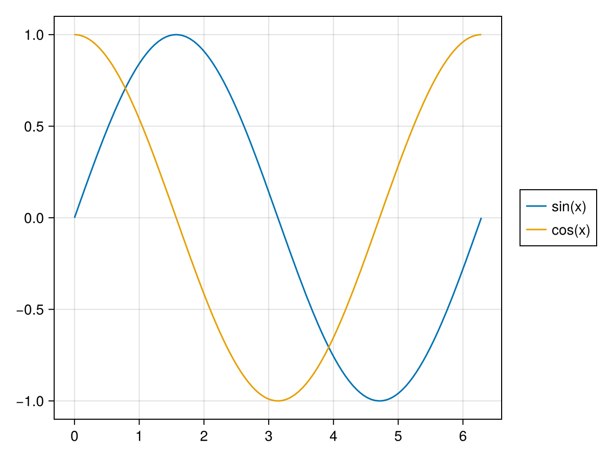
The example above with the sine and cosine curves beg the question of how to add a legend to a plot, which is usually a given when there are multiple plots on a given set of axes. We can do this with the example above by giving each curve a label and then adding a Legend to the Figure. The following will do this:
where first notice that we have added a label to each curve as a string and then the 3rd line will create a Figure and place it to the right of the plot (because of the fig[1,2]). The resulting plot is
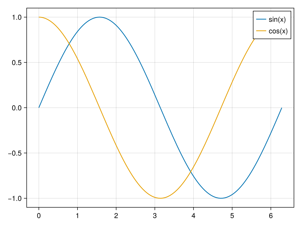
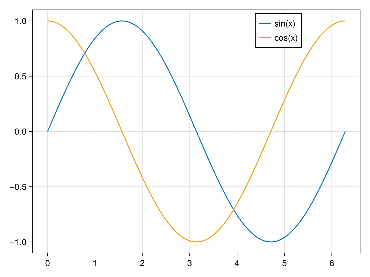
The location of the legend isn’t great in this situation. One can add the location option to the axislegend method which is a symbol of two characters, the first being "l", "r" or "c" for left, right or center for the horizontal placement and the second being "t", "b" or "c" for top, bottom or center for the vertical placement. Alternatively, it can be set as a tuple that is interpreted as the horizontal and vertical location as fractions from the lower left. To slide the legend box over just a bit we can use
We saw above when plotting a trigonometric function that we often would like to use multiples of \(\pi\) for the x tick marks. We’ve seen that if we make multiples of \(\pi\text{,}\) we get floating point approximations on the axes. We will use a new package LaTeXStrings to use the power of LaTeX to make nicer looking plots.
First, make sure that you have added LaTeXStrings to your julia installation and include using LaTeXStrings to your notebook. In short, this package just makes it easier to enter latex into strings to be properly rendered. If you want to enter \frac{\pi}{2} into a julia string (and this is true in many languages), because backslash is a special character, to enter a backslash, we’d need to add \\. Therefore the string above would be "\\frac{\\pi}{2}" and although this isn’t too hard, LaTeXStrings makes it easier. It provides the string macro L as in
and this will produce the latex output \(\frac{\pi}{2}\text{.}\)We will use this to produce nicer tick labels. But first, let’s just use LaTeXStrings to make a nicer title. The code
In this case, we have used the axis option of the lines function, recalling that the axis needs to take a named tuple and if there is only one value, a trailing comma is necessary. The result of this is
Notice that the tick_pos variable on line 1, defines where the ticks will be located on the \(x\)-axis. The xlabels is an array of latex strings. If there is a way to simplify this, then you can use a comprehension, a map or a loops to do this, but for simplicity, we just type these out. And then lastly, notice that these two variables are fed to the Axis using the xticks option as a tuple.
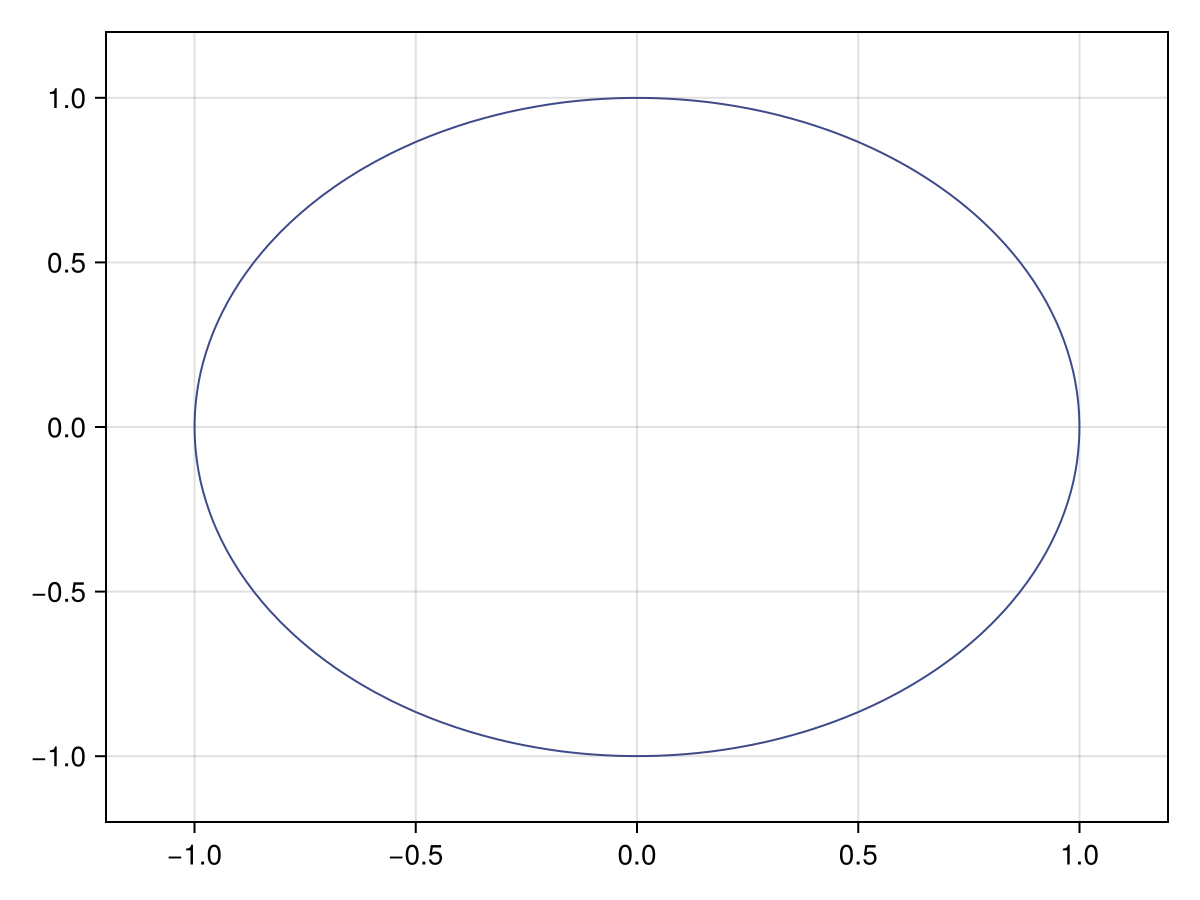
Recall that in Subsection 13.4.6, an implicit plot is the set of points \((x,y)\) in which \(f(x,y) = c\) for some function \(f\) and constant \(c\text{.}\) As shown in that section, the classic example of this is that of a circle in the form \(x^2+y^2=1\text{.}\) Using makie, we use the contour function (more on this function below) as in
where there are \(x\) and \(y\) points defined to create a grid, a function (in this case we use an anonymous one) and the option levels=[0] to create the correct plot. The result of that above is:
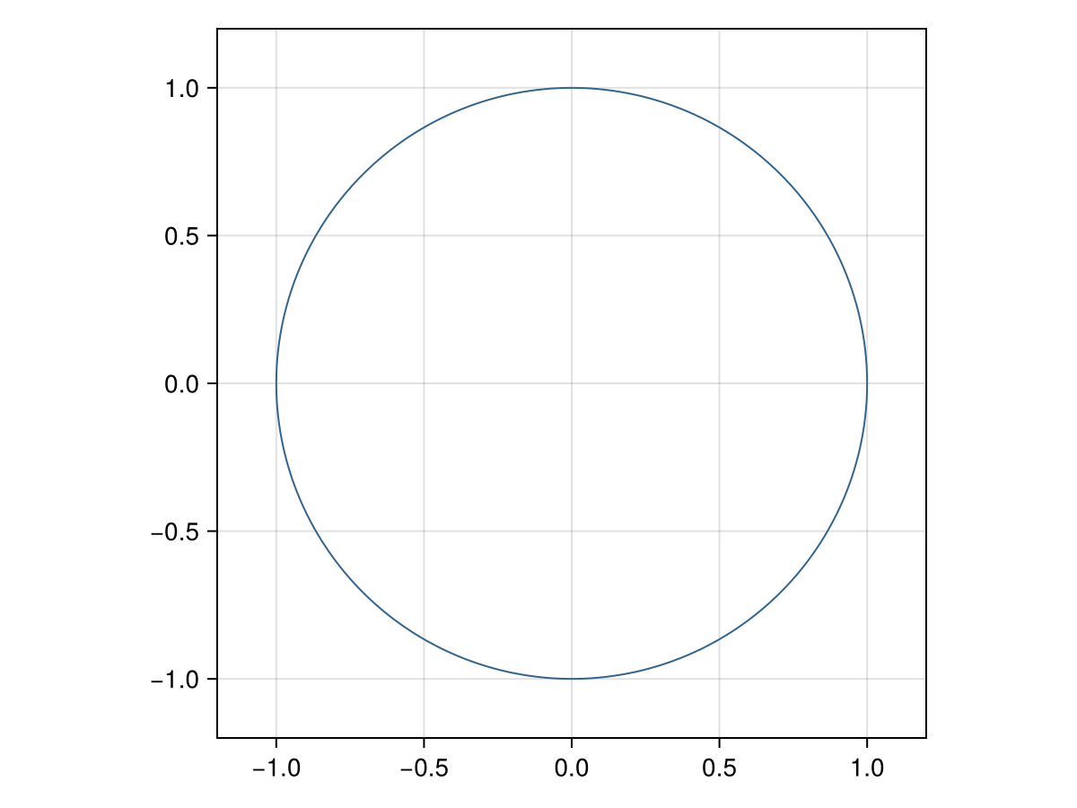
Wait. You said we’re plotting a circle, but this clearly is not a circle. Looks like an ellipse. The reason this occurred is that the aspect ratio of the plot is not one, therefore an object that we would expect to have a certain form may not. 2
Another classic example is that if there are normal lines either to a curve or two each other, if the aspect ratio is not one, they will not look to be normal/perpendicular.
We add the apsect = 1 as an option to an Axis as in
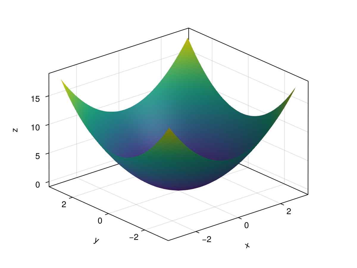
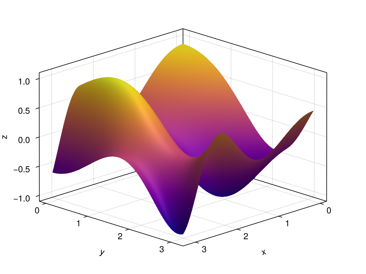
If we have a function of two variables, a nice plot that shows the function is that of a surface plot, in which the height of the surface is the value of the function. A function of two variables is \(f(x,y) = x^2+y^2\) and we can plot this using Makie with the surface function.
Overall, the structure is the same in which there is a grid created (line 2) that both \(x\) and \(y\) take on values in \([0,\pi]\) and then use the function to create the \(z\) values. This time, we create a Figure and Axis object, however, in this case, we need an Axis3 object.
We also change the perspective of the plot with the azimuth (the angle of rotation around the \(z\)-axis) which can take on values between 0 and \(2pi\text{.}\) The elevation option is the angle that the viewpoint is above or below the \(xy\)-plane. Values can be between \(-\pi/2\) and \(\pi/2\text{.}\) Try changing these to see the view point change.
Notice also that we have added a new option \(colormap\) which changes the colors of the height of the surface plot. Above is :plasma and all of the colors are Symbols (start with a colon). There are hundreds of options, but the easiest way to see what is available at Makie’s color documentation page. Try changing these. There are also ways of creating custom colormaps.
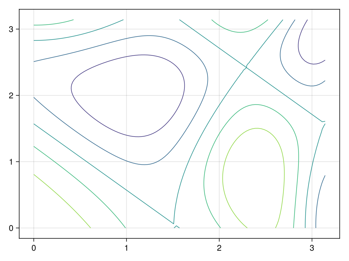
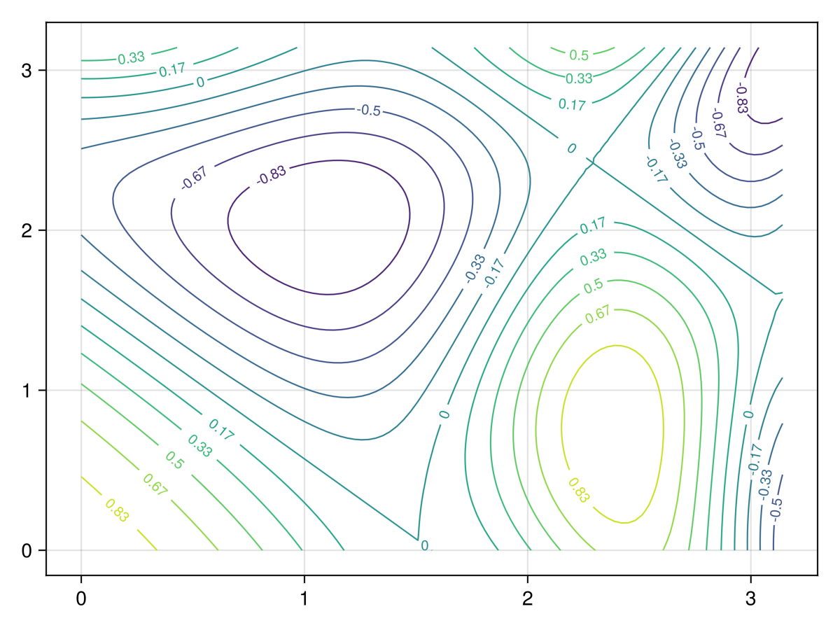
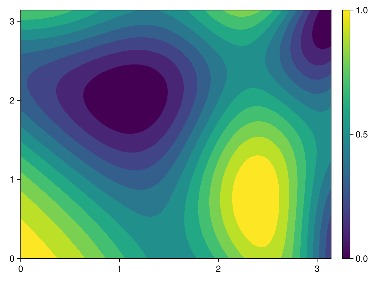
As mentioned in Chapter 13, a contour plot is generally used for functions of two variable, like \(f(x,y)\) and the plot is curves of constant function value or \(f(x,y)=C\) for various values of \(C\text{.}\) Using the function in (14.1), the following code will produce a contour plot of the function:
And recall that a contour plot is basically like a topographical map if you have ever used one of those. The concentric circles are either a hill (maximum) or a depression (minimum) and unless we know what function values, we’re not sure which is why. To help with this we will add labels to the contours and increase the number of contours used with the levels attribute.
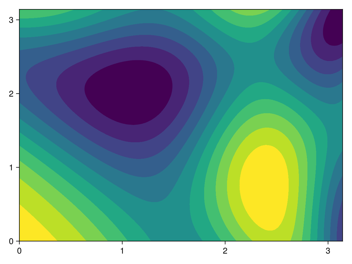
Another related plot is that of a filled contour plot in which the regions between contours are filled with colors. This is more of a visually nice feature rather than an important distinction over the previous contour plot. A filled contour plot can be created with the contourf plotting command as in this example:
And since the colors play an important role in a filled contour plot, it is helpful to know the function values for a give color and using a colorbar is a way to do this. We can add a colorbar with the following code:
Note that the plotting range is \([0,\pi]\) in both \(x\) and \(y\) for all of these plots. Use the methods from above to 1) make the aspect ratio 1 and 2) change the tick marks to multiples of \(\pi\text{.}\)
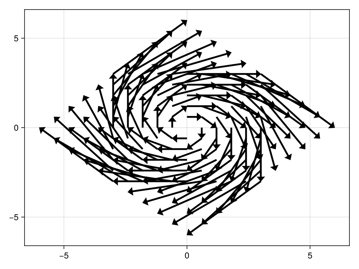
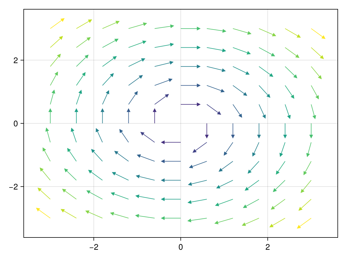
First, consider a vector field which is is a pair of functions of \(x\) and \(y\) often written as \(\vec{v} = \langle F(x,y), G(x,y) \rangle\text{.}\) For any point in the plane \((x,y)\text{,}\) the vector \(\vec{v}\) is a vector. For example, consider \(v=\langle y, -x \rangle\text{.}\) We first start with the arrows2d method:
This is a bit hard to read because the arrows overlap. This is mainly because the arrow length are exactly the size of the vector field at the point. For example at \((1,2)\text{,}\) the vector is \(\vec{v} = \langle 2, -1 \rangle\) and the length of this is \(\sqrt{5}\approx 2.23.\text{,}\) which overlaps nearby arrows. One inital way to address this is to set the lengthscale attribute. Also, in my opinion the arrows seem a bit heavy and we can change this with the shaftwidth and tipwidth options as follows:
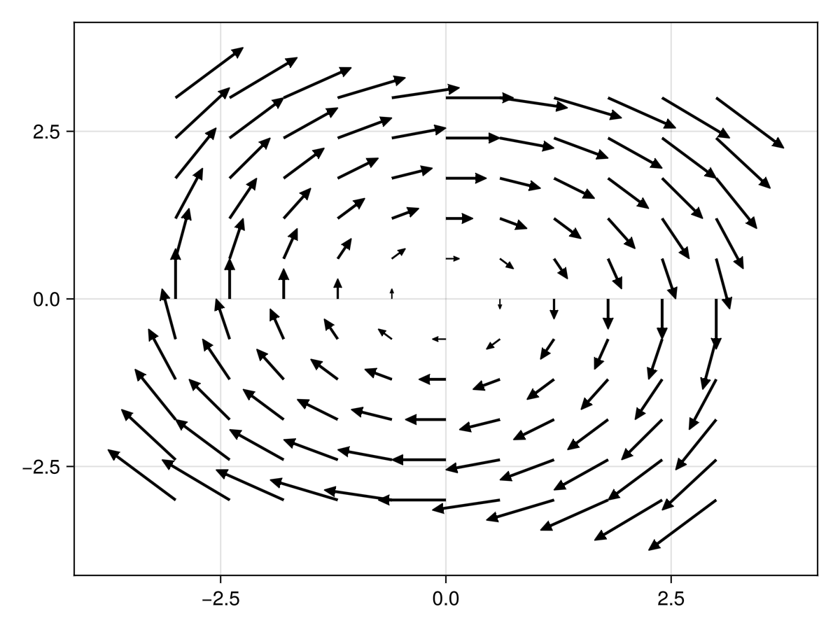
Another way to handle this is to produce a direction field which normalizes all of the arrows to make them the same length to do this. There is a option called normalize that does this as in the following:
Since Makie is very good with color, there are some options to make this a bit more colorful. The arrowcolor and linecolor can be used with the str variable to give each arrow a color. The following:
Note that the strength variable is a Matrix and both arrowcolor and linecolor can take a color, but also a vector of values. This is why the str variable is wrapped in the vec method.
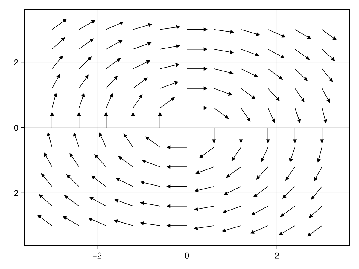
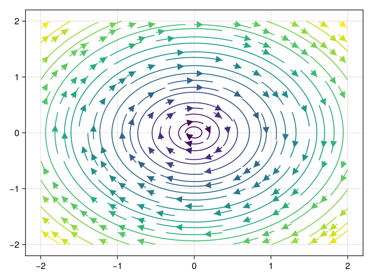
A streamplot is related to a vector field plot (arrow plot) in that the arrows follow along continuous curves that are also plotted. A difference for plotting these in Makie is that instead of building the vector field, that the function is given and then plotted on the given plotting domain. We will plot the same field above with:
Note that the first argument of the streamplot is a function of x a vector to a Point2f object. For the vector field plots above using the arrows2d function, we created a grid of points and notice that streamplot does not. This looks more like a function plot with the a..b notation. This is due to the fact that the streams are continuous functions—the plot above are circles.
Section14.11Updating axis elements in a shorthand manner
As we have seen above, updating information from an axis requires setting options on the axis object. We have accomplished this by first making a Figure and then an Axis object and finally adding plots to the axis. This is sometimes overkill. In this section, we will see an alternative if the options are short.
An astute eye notices the comma after the string that is the title option. This is not a typo. Try removing it and you’ll see an error. Why is that needed then?
the output is "string", it doesn’t appear to be a tuple. What the above has done is just assign the string "string" to the variable a. To create this as a tuple a comma is needed as in (a = "string",) and the result is the desired output.
As described in Section 13.5, Makie is a set of high level plotting commands. The hard work of drawing lines, circles and regions on the screen is done with a backend and the idea is to be able to switch backends easily without changing the high-level code to produce a plot. Makie has four such options currently: CairoMakie, GLMakie, WGLMakie and RPRMakie and you should have seen the first two appear above in the plotting code.
CairoMakie uses the Cairo drawing engine underneath and excels at high-quality 2D drawings that are non-interactive. The output in generally either an SVG or PDF and since these are vector-based drawing formats, these will produce high-quality graphs for print (and the screen).
GLMakie is the native, desktop-based backend, and is the most feature-complete. It requires an OpenGL enabled graphics card with OpenGL version 3.3 or higher.
Experimental ray tracing backend using AMDs RadeonProRender. While it’s created by AMD and tailored to Radeon GPUs, it still works just as well for NVidia and Intel GPUs using OpenCL. It also works on the CPU and even has a hybrid modus to use GPUs and CPUs in tandem to render images.
WGLMakie is the web-based backend, which is mostly implemented in Julia right now. WGLMakie uses Bonito to generate the HTML and JavaScript for displaying the plots. On the JavaScript side, we use ThreeJS and WebGL to render the plots. Moving more of the implementation to JavaScript is currently the goal and will give us a better JavaScript API, and more interaction without a running Julia server.
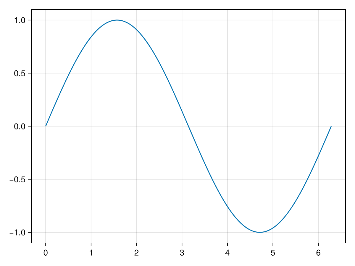

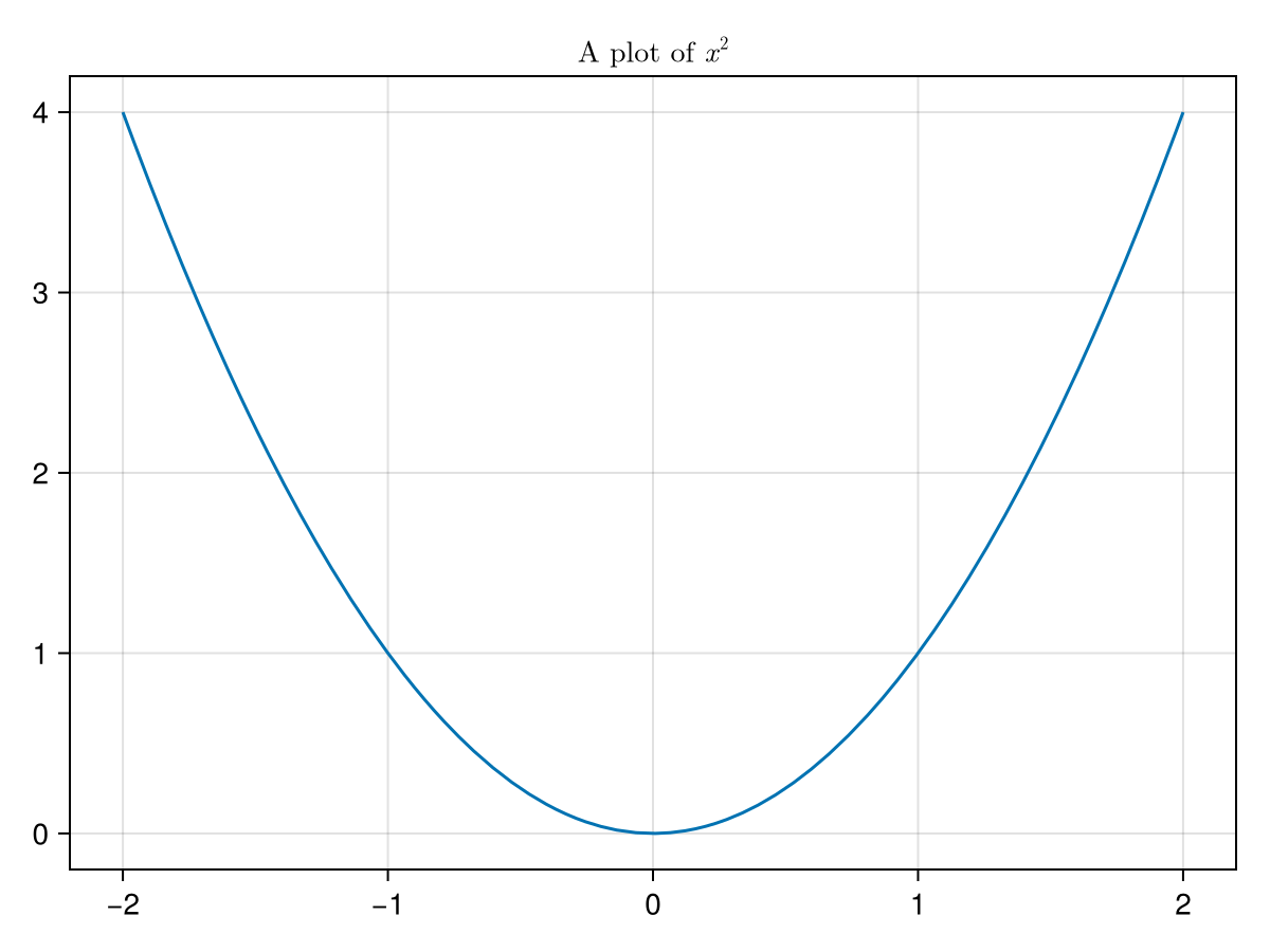
![A plot of sin(x) on the interval [0,2pi]](external/plots/makie/sine.png)